Identifying Signs of the Solar Revolution Using Maps and Graphs
This article is a rehosting of the full article that first appeared in Solar Tribune, a solar news, education, and advocacy website where I contribute as a featured writer.
Solar power has been among the most exciting and promising renewable energy technologies of the past decade as panel efficiencies have improved, manufacturing costs have decreased, and people have realized its immense potential and ability to adapt to different environments and applications. However, solar energy is not without its naysayers who point out that “solar energy barely moves the needle in the U.S. energy mix.” Such pessimism evokes the quote from Energy: A Human History regarding the Industrial Revolution, which states that the average Englishman:
“..would be in no doubt about the occurrence of a revolution across the Channel in France, but he would have been astonished to learn that he was living in the middle of what future generations would also term a revolution.”
The Industrial Revolution was the most significant transformation in energy use in human history, so the idea that those living at the precipice of it did not recognize its significance is eye-opening. Perhaps the recent rise in solar power is only beginning to move the needle, but like the Industrial Revolution we are in fact at the foot of a similar solar power (and, more broadly, renewable energy) revolution in the United States.
To test this idea, looking at the prevalence and growth trends of U.S. solar provides more than a handful of clues. Just as was done in my previous analysis of the U.S. energy mix, let’s examine this evidence through five sets of maps and graphs.
Important to note is that the data for these graphics comes from the U.S. Energy Information Administration (EIA) and their detailed state data for the U.S. electric power sector in 2017— and this data thus does not include residential and commercial solar setups, which account for about 1/3 of the country’s total overall solar generation. This analysis focuses on utility-scale power to capture the applications most likely to displace fossil fuel baseload generation.
1. Demonstrating current penetration of solar power across states
Overall, the United States saw over 53 million megawatthours (MWh) of solar generation in the electric power sector in 2017, accounting for 1.3% of total generation. To zoom in a bit, the following maps represent the total solar power generation in the electric power sector for each state.
These maps reveal the wide range of penetrations solar power has made in the electric power sectors among various states. While California leads the nation by a wide margin at over 24 million MWh generated (more than four times the generation of second place North Carolina), eight different states exceeded 1 million MWh of solar generation in 2017. For reference, the average U.S. household consumes about 10,800 kilowatthours (kWh) per year– meaning 1 million MWh is enough to power almost 100,000 homes for a year. On a percentage basis, solar power accounted for 11.8% of California’s electric power sector and 10.9% of Nevada’s, the nation’s leader in that regard.
On the other end of the scale, though, 5 states had no solar generation by utilities in 2017 and another 14 states fell below 50,000 MWh of solar generation, accounting for quite a small portion of the energy mixes in those states. In terms of portion of the energy mix, 12 states saw solar power between 1% and 6% of their electricity in 2017 and another 36 falling below 1%.
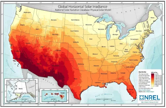
The breakdown of where solar generation in the electric power sector is prevalent or not largely lines up with the following map, generated by the National Renewable Energy Laboratory, that displays the strength and prevalence of solar irradiance (a proxy for how much sunlight hits a region during an average day and thus how much potential solar power could be generated):
Source: National Renewable Energy Laboratory
The miniscule solar generation totals of certain regions are the numbers solar pessimists are seeing when pointing out the supposed non-viability of solar as a national energy solution (while ignoring the massive generation in California and other U.S. leading states). But like the Englishmen who failed to see how the nascent steam engine was about to change the world, these critics are only seeing part of the story.
2. Identifying age of solar power in each state
A chief aspect of electric power sector solar generation that too often gets overlooked is how young the industry is in most of the United States. To demonstrate that idea, the below map highlights when each state first saw solar generation contribute to the electric power sector, while the graph below the map shows the annual growth in number of states with solar generation and overall U.S. solar generation.
The important takeaway here is how starting in 1990 (when EIA data on the state-by-state electric power sector is first available), only three states had any utilities with solar generation. From then through 2007, that figure remained below five states. The fact that solar did not account for a significant portion of the U.S. energy mix through then should thus come as no surprise. In the past decade, though, solar has expanded into about 4 new states per year, reaching a total of 45 states in 2017. With that presence in new states came an increase in total generation that averaged about 61% per year. That type of sustained growth is the harbinger of solar revolution, corroborated by further analysis of this data.
3. Comparing solar with other renewable energy sources in state electric power sectors
Another telling approach to the solar data is comparing solar generation with other notable generation sources. While some states generate a majority of their electricity from a single fuel (such as Rhode Island’s electricity sector being 92% reliant on natural gas and West Virginia’s 93% on coal), most states rely more evenly on numerous energy sources. Solar power is not yet the greatest source of generation in any state, and as of 2008 (the first year in which at least 10 states had solar generation in their electric power sectors) solar was not even among the top two most prominent renewable energy sources in any state. But, as the following maps show, that has changed in the years since:
Among the six renewable energy sources tracked in EIA’s data (hydroelectric, wind, solar, geothermal, wood and wood derived fuels, and other biomass), solar power went from the least prevalent across the United States to the third most prominent (behind only hydroelectric and wind). Meanwhile, on a state-by-state basis, solar power went from:
41 states with no solar generation in 2008 to just 5 in 2017
1 state where solar was present but below all other renewable sources in 2008 to 0 in 2017
3 states where solar was the fifth most common renewable source in 2008 to 11 in 2017
4 states where solar was the fourth most common renewable source in 2008 to 16 in 2017
1 state where solar was the third most common renewable source in 2008 to 9 in 2017
0 states where solar was the second most common renewable source in 2008 to 7 in 2017
0 states where solar was the most common renewable source in 2008 to 3 in 2017
Given that 6 states rely on renewable energy generation sources for a majority of their electric power sector and 16 get at least a quarter of their total energy mix from renewables, solar’s rise in the renewable ranks is telling. Renewable energy is becoming critical to the grids across the nation, and solar is an increasingly vital part of that push.
4. Analyzing absolute growth of the solar sector on a state-by-state basis
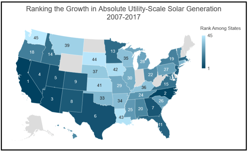
In addition to seeing how solar power has grown in rank among renewable energy sources in each state, examining which states have seen their solar power grow most quickly in the electric power sector provides insights into different regions of the country. The top 45 states (excluding the 5 with no solar in 2017) in absolute generation growth over the past 5, 10, and 20 years can be ranked as follows:
These different windows of time are typically useful to examining how trends have changed over the years, but what these three maps instead demonstrate is that the ranking of growth remains mostly uniform over the different time periods– 33 of the 45 states don’t move more than three spots in the rankings between time periods. Two aspects of the solar growth in utilities factor into this trend:
The early solar adopters got ahead of the learning curve by entering the market a decade or two before many other states (the top 4 states in growth over each of these time periods– Arizona, California, North Carolina, and Nevada– account for over two-thirds of total solar growth and were each among the first 10 states with electric power sector solar generation) which got the ball rolling early and kept them in the lead.
Almost 92% of solar generation growth in utilities across the nation has come online since 2012, so the states that added the most over that 5-year period are mathematically also the states that added the most over the 10-year and 20-year periods as well.
These facts are compelling proof about the quite recent nature of solar growth and the further room solar still has to grow in the electric power sector.
5. Breaking down the top years for solar growth across the country
The last evidence for the blossoming solar revolution comes in the following tables that demonstrate the most notable years of growth. Starting with overall U.S. solar growth in the electric power sector, the data shows the following:
Looking at the top 10 years for electric power sector solar growth across the country, the 8 individual years of most significant growth have come over the past 8 years, with the growth increasing in magnitude in 7 of those years. That’s what forecasters (and future historians) might look at as an inflection point of revolutionary growth.
Investigating the data on a state-by-state basis, the following table lists each instance when a state added more than one million MWh of solar generation to the electric power sector:
Two notable takeaways jump out from this table:
Across the country, seven unique states have had a year of such tremendous growth, which shows that the revolution is not restricted to just one or two states.
Of the 14 times such growth has happened, 11 instances have occurred in the past two years and the other 3 happened since 2013, which shows that the most significant and important growth is happening today and such growth shows no signs of plateauing or dropping off.
In the end, the discussed data and graphs tell a story quite different from those who knock the potential of solar power. Solar only really gained significance in the electric power sector of the United States in the past decade, with no presence in 46 states until 2008. These new markets and this quickly advancing growth is the story to watch– not just where solar generation is today but how quickly and recently it has ascended and will continue to grow. The technology is only improving and the costs are dropping. As those characteristics of solar continue to be refined, future generations will look back at these several years and wonder how we saw anything but potential for revolution in solar power.
Are there any other map-based energy visualizations you’d like to see? Let me know in the comments below or on Twitter.


