Putting Electricity Generation on the Map: State-by-State Energy Data Visualizations

Among the most commonly shared data visualizations across social media and the Internet at large are maps of the United States that display distinctive characteristics for each state– unique jobs to each state, most recognizable brand from each state, and even the emoji each state uses most disproportionately. The trend of these types of graphs became so widespread that they even got a mocking treatment from the xkcd webcomic:
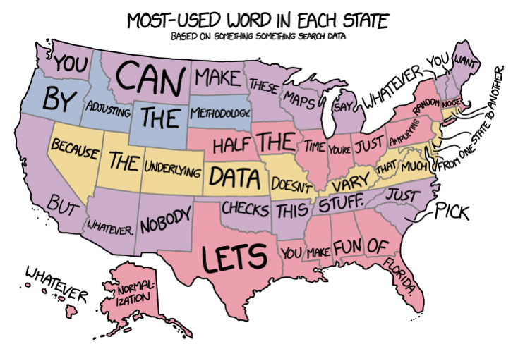
Source: xkcd
With the vast quantities of historical state-level data available from the Energy Information Administration (EIA), I decided to put the xkcd parody’s claims to the test, while analyzing what broad conclusions could be made about U.S. energy trends and how they vary state-by-state and region-by-region using these map-based data visualizations.
Note: Last week as I was finishing up this article, EIA beat me to the punch on these state-by-state visualizations– though I take the analysis in a different direction than they did, so both those articles and this one are worth a read. Check out these two articles from EIA to read more state-by-state energy analysis: Coal is the most-used electricity generation source in 18 states; natural gas in 16 & Hydroelectricity is the most prevalent renewable source in 19 states; wind in 16.
Most prominent energy source in each state’s electric power sector
The most straightforward place to begin is charting the energy source that is most prominent in each state’s electric power sector. First, note that nationwide the energy mix for utility-scale electricity generation in 2017 broke down thusly:

As this graph shows, natural gas was the most common fuel source for U.S. electricity in 2017, having recently taken that crown from coal. And while renewable energy has made great strides recently, they still lagged well behind fossil fuels in total generation and also collectively trail nuclear power.
But each of these energy sources varies widely from state to state, as the U.S. energy mix is anything but homogeneous. As such, the question at hand is the identity of the most prominent single electricity source in each state. Turning again to EIA, the 2017 data indicates the following:

The United States breaks down into: 18 coal states, 16 natural gas states, 9 nuclear states, 6 hydroelectric states, and 1 petroleum state (as well as the ‘other biomass’ category representing the District of Columbia, or DC). Analyzing further, we can draw some preliminary conclusions:
Coal and natural gas, the main fossil fuels of the electricity sector, dominate the most states. Whether a state leans towards coal or natural gas is the result of production and infrastructure– Texas, Oklahoma, and Louisiana are three of the top four gas producing states, while the rest of the states on the Gulf of Mexico are geographically near enough that transporting gas is cost-effective (reflected in the below map of natural gas pipelines). Coal is second to natural gas in national prominence, but it leads all electricity sources in the greatest number of states. These 18 coal states include Wyoming, West Virginia, and Kentucky, three of the top five coal producing states, while many of the other Midwestern states have direct access to those supplies, forming the heart of coal country.

Nuclear power is the leading source for the utility sector in nine states. While most fuels are present in just about all states, the United States contains less than 100 nuclear power reactors and they are concentrated in just 29 states (see below map). Three nuclear reactors is the key number, as almost half of states with at least three nuclear reactors use nuclear power more than any other electricity source, and six out of the nine states where nuclear power leads all generation have at least three reactors.

Source: NRC
Hydropower is among the world’s oldest power sources and hydroelectric generation is the most prominent source of U.S. renewable energy, but also noteworthy is that hydroelectric generation was the leading source of electricity in six states. These states, mainly located in the Northeast and Pacific Northwest, contain the necessary geography and natural resources for widespread hydropower, with the below map of U.S. hydroelectric generators displaying their wide prominence.

Last are the two outliers, Hawaii with petroleum as its most common electricity source and DC with other biomass. Because of Hawaii’s geographic isolation from the rest of the United States; lack of established oil, gas, or coal resources on its own land; and electricity consumption that exceeds its production, the state is highly reliant on imported petroleum for power– though Hawaii is looking to fix that, becoming the first state to enact a 100% carbon-neutral goal. DC is also unique in that its small size means that almost all its power comes from outside city limits, through the distribution system of the local electrical utility. When focusing on utility-scale production from within its borders, though, biomass leads DC generation through the district’s wastewater treatment plant where digesters can produce about 10 megawatts of power for on-site use to reduce the plant’s electricity costs.
Each state’s most disproportionately utilized energy source
No one following the energy industry would be surprised with the outcome that coal and natural gas are the most common source fuels for the electric power sector in most states. However, more nuance can be gained in mimicking the original inspiration for this article: what’s most unique to each state?
The answer to this question is determined by finding the energy source whose share of the energy mix in each state is the most above that source’s share of the national energy mix. The following map displays each state’s resultant ‘most disproportionately utilized’ energy source:

As expected, many states (37 plus DC) show the electricity source that was previously determined to be the state’s most common, as those states are so reliant on that energy type that it is also mathematically their most disproportionately utilized (the most extreme examples being Rhode Island’s electricity sector being 92% reliant on natural gas and West Virginia’s 93% on coal). The compelling information comes from finding the differences between this map and the previous one of each state’s most common source of electricity:
The most critical story told by this map compared with the first one is the emergence of wind power. As of 2017, no state produced enough wind generation to make it the most common energy source, but Minnesota, Iowa, Kansas, and Oklahoma utilize wind enough for it to represent their most disproportionate source. In fact, EIA expects that Kansas or Iowa will shortly become the first state where wind will provide the largest single source of electricity.
Michigan, Alabama, and New Jersey are added to the list of prominent users of nuclear power, each home to at least four nuclear reactors. While such high prominence wasn’t enough to make nuclear the most common energy source in 2017, they are still well ahead of most of the country.
Hydroelectric generation is most disproportionately represented in the energy of mixes of California, Montana, New York, and Alaska. While fossil fuels are still the most prominent in these four states, their geography also features the prominent naturally flowing waterways that allow them to tap into hydropower.
Lastly, Maine shows a disproportionate amount of wood and wood derived fuels, generating almost a quarter of the state’s electricity compared with just 1% across the United States. Maine is covered 90% in forests, so wood derived fuels are plentiful and inexpensive, which (when combined with the plentiful hydroelectric generation) provides the state with the lowest average electricity price in New England.
Fastest growth and greatest drop in electricity generation source in each state over the past 10 years
The discussion thus far has centered on 2017 electricity data, but state energy mixes are not static figures. Rather, the U.S. electricity sector has recently experienced a great transformation:

In the past decade, natural gas closed the gap on coal and became the most prominent U.S. electricity source, while wind nearly caught up to hydropower as the most prominent renewable source and solar exploded from 2,000 megawatthours (MWh) per day to 145,000 MWh/day (despite all the hype of its increasingly competitive prices and improving efficiencies, solar generation is still far enough down the totem pole that it’s growth is barely visible on the above graph, but the optimism of solar is justified based on its potential– particularly in residential/commercial applications for which this electric power sector data doesn’t account). But each source’s rate of growth differed depending on the state, as shown by the below graphic highlighting the electricity source that grew by the greatest amount (in total generation) from 2007 to 2017:

This map makes two conclusions evident: wind power is on the cusp of becoming a dominant energy source across many states (thanks to decreasing construction costs) and natural gas generation has greatly grown in prominence (largely due to decreasing fuel costs compared with coal and other competitors). This visualization also demonstrates notable gains for solar power, hydroelectric power, wood and wood derived fuels, and nuclear power. Notably absent is coal and petroleum.
The story can’t be completely told without the other side, though. As generation from some energy sources increase, decreases in others come hand-in-hand (except where total energy demand is increasing).

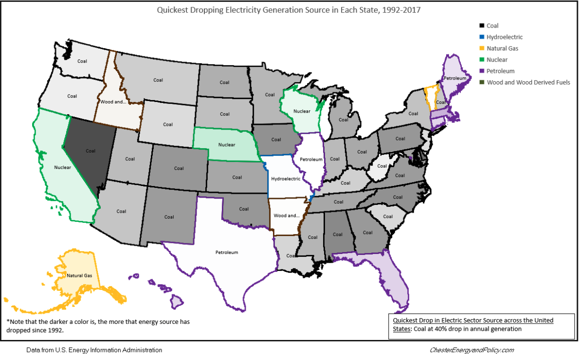
Coal is plainly the big loser of the past decade, dropping by the greatest amount in 40 different states, while natural gas dropped the most in five states and petroleum in one state, meaning a fossil fuel was responsible for the greatest drop in 92% of states. Otherwise, two states saw nuclear power drop the most (Nebraska, for example, closed nuclear plants amid economic concerns) and two saw wood derived fuelsdrop the most (potentially due to environmental concerns of burning wood on a utility scale).
What’s most noteworthy, though, is that every state where a fossil fuel dropped by the greatest amount aw the most growth in an electricity source that is less carbon emissive– either natural gas replacing coal(as gas emits less than half the CO2 of coal) or carbon-neutral renewable or nuclear power replacing a fossil fuel. This trend demonstrates that even without any national carbon tax or mandatory emissions requirements for power plants (Obama’s Clean Power Plan was never allowed by the Trump administration to go into effect, though some states have implemented clean energy mandates of their own), the electricity sector is still naturally shifting to less emissive energy sources. Such transformation can be attributed to the economics of clean energy becoming harder to ignore, as well as utilities recognizing that clean power mandates may not be on the books today but they likely will be soon.
To get another perspective, we can also zoom out a bit further…
Fastest growth and greatest drop in electricity generation source in each state over past 25 years

These similar quickest growing/dropping electricity source maps mirror the previous ones, but they look at a 25-year period. The main difference comparing the 25-year changes with the 10-year changes are that natural gas’s growth was a lot more evident over the 25-year period, while petroleum had a more important role as a source of electricity 25 years ago (with that importance mostly dropping off prior to 2007).
In terms of absolute generation, the greatest leaps over the two defined time periods are the following:
Greatest increases over past 10 years:
Florida +60.2 million MWh natural gas
Texas +58.1 million MWh wind
Pennsylvania +40.3 million MWh natural gas
Greatest increases over past 25 years:
Florida +140.7 million MWh natural gas
Texas +68.8 million MWh natural gas
Pennsylvania +56.7 million MWh natural gas
Biggest decreases over past 10 years:
Pennsylvania -75.0 million MWh coal
Ohio -64.5 million MWh coal
Georgia -57.8 million MWh coal
Biggest decrease over past 25 years:
Pennsylvania -61.5 million MWh coal
Ohio -52.7 million MWh coal
Alabama -29.7 million MWh coal
Beyond those greatest leaps, a number of electric generation sectors sprung into existence that accounted for no generation in certain states 25 years ago, while some other significant sources of generation 25 years ago are no longer in operation today. Since 1992, nuclear generation was eliminated from three states, wood and wood derived fuels in three other states, and all coal and petroleum generation in DC was shuttered. In that same period, the electric power sector birthed new solar power in 41 states, wind power in 35 states, biomass in 10 states, wood and wood derived fuels in 5 states, and geothermal in 3 states– notably, outside of DC gaining natural gas generation for the first time, all electricity generation sources that first emerged in states during the past 25 years were renewable.
In the end, the story stays consistent– more expensive and CO2-emitting energy sources (coal, petroleum) continue to lose their foothold in favor of cleaner and cheaper fuel (natural gas, nuclear, wind, hydroelectric, and solar). No matter how you slice it, by playing around with these types of maps you come away with the undeniable belief that cleaner energy has been replacing and will continue to replace dirtier fuels– and that’s an encouraging conclusion, indeed.
Are there any other map-based energy visualizations you’d like to see? Let me know in the comments below or on Twitter.