Correlating Energy Data Sets: The Right Way and the Wrong Way
Determining the correlation between multiple sets of data—a measure of whether data sets fluctuate with one another—is one of the most useful tools of statistical analysis. Correlating data sets can be the endgame itself, or it can be what cracks open the door on a full statistical investigation to determine the how and why of the correlation. No matter the reason, knowing what data correlation is, how to correlate data sets, what a confirmed correlation might mean are all necessary ideas to have in your tool belt.
What is data correlation?
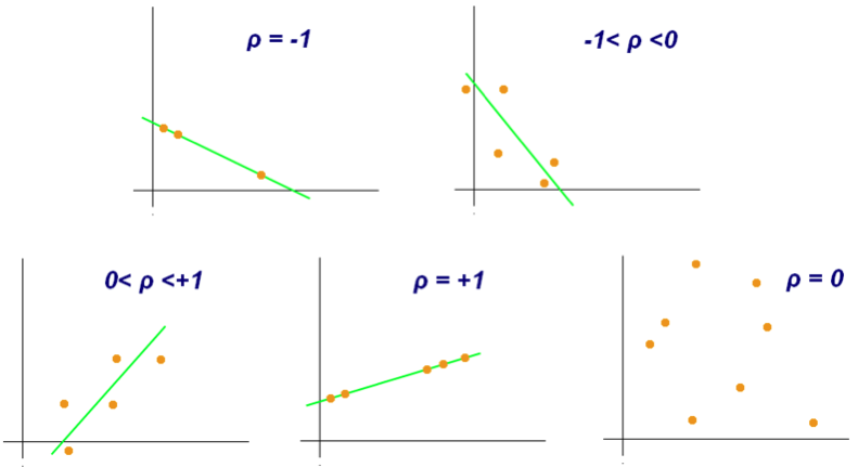
Generally speaking, correlation examines and quantifies the relationship between two variables, or sets of data. In statistics, data correlation is typically measured by the Pearson correlation coefficient (PCC), which ranges from -1 to +1. Whether the PCC is positive or negative indicates whether the relationship is a positive correlation (i.e., as one variable increases, the other variable generally increases as well) or a negative correlation (i.e., as one variable increases, the other variable generally decreases). The absolute value of the PCC indicates the strength of the relationship, where the closer it is to 1 the more strongly related the two variables are, while a PCC of 0 indicates no relationship whatsoever.
Source: Wikicommons
How do you calculate data correlations?
The PCC of two variables can be easily calculated with a built-in function of Microsoft Excel (if you want to know how to calculate the PCC according to hand—first, kudos to you, scholar; second, see either this resource or this one for more detailed instructions on the calculation itself).
To start, list out your two variables in two columns of an excel sheet. For this example, we’ll pull the West Texas Intermediate (WTI) oil prices and the U.S. regular grade gasoline prices during a four-month period in the Fall of 2016 from the website for the Energy Information Administration (EIA) (for guidance on pulling data from EIA, see this previous blog post).
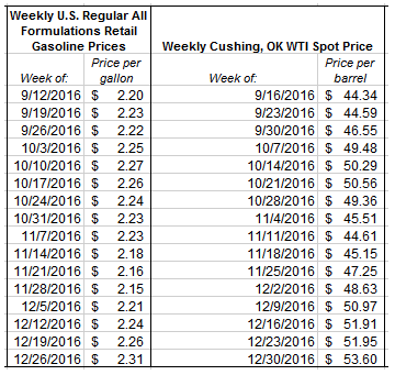
Note that the weekly prices here reflect the average price calculated for the week ending in the date listed. Also the Cushing, OK WTI spot price reflects the price of raw crude oil in Cushing, OK, a major trading hub for crude oil that is used as the price settlement point for WTI oil on the New York Mercantile Exchange (NYMEX).
Now to find the PCC, use the excel function CORREL. This function takes the form of the following:
=CORREL(ARRAY1, ARRAY2)
where ARRAY1 and ARRAY2 are the two data sets you are seeking to correlate.
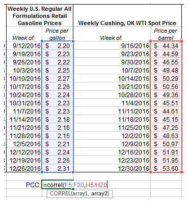
Using this excel function, we get a PCC of 0.545. Remember that a positive PCC indicates that the two arrays tend to increase with each other,and that the closer the PCC is to 1 then the more closely related they are. This result of 0.545 would seem to indicate a fairly decent correlation between the price of WTI oil and the price of regular gasoline over these several months. Not only does a positive correlation between the prices of these two products make intuitive sense (because the price of crude oil is the largest factor in the retail price of gasoline), but we can confirm with a data visualization as well.
Data Source: U.S. Energy Information Administration
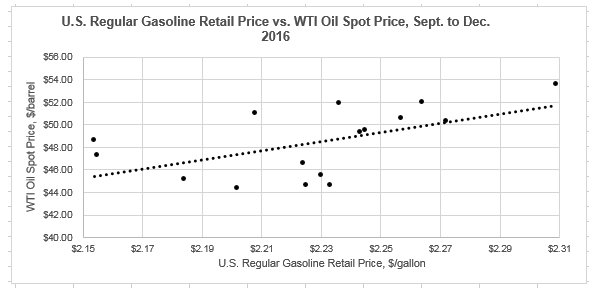
Data Source: U.S. Energy Information Administration
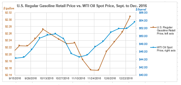
Note that the first graph is showing the change in the two prices over time, with the date on the x-axis and the prices on the two y-axes. Visualizing the data this way, we can see that the prices are climbing and falling somewhat step-in-step. The second graph shows the relationship in a different way, with the price of oil on a given week on the x-axis and the price of gas on the same week on the y-axis. Visualizing it this way, and including a trendline for that data, you again see that as one variable rises, generally so too does the other variable. However, clearly it isn’t a direct one-to-one relationship—hence why the calculated PCC is 0.5455 and not closer to 1.
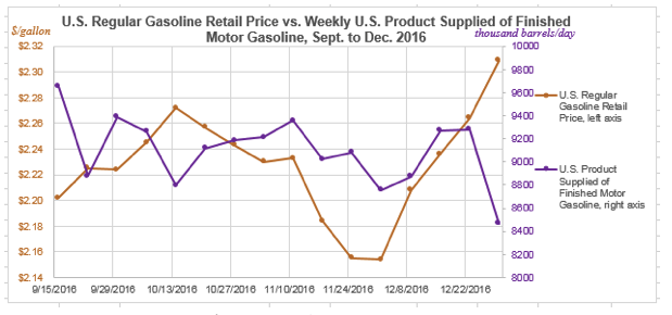
As a second example, let’s now find the correlation between gas prices during this same time period with the quantity of finished motor gasoline supplied to the market—as basic economic principles give us a sense that there should be a relationship between quantity sold and price. Below we again pull the relevant data sets from EIA and use the CORREL function
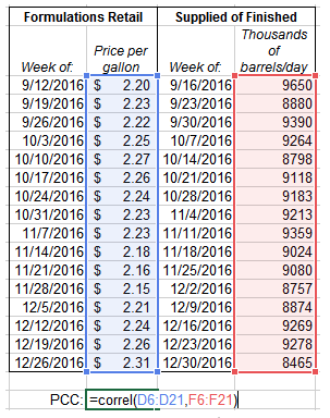
Note that the weekly prices here reflect the average price calculated for the week ending in the date listed.
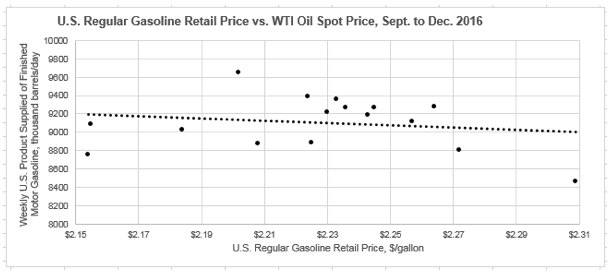
For these two variables, we get a PCC of -0.173. Now that the PCC is negative, this implies a negative correlation—i.e., as the gasoline price increases, the amount of gasoline sold decreases. This conclusion again makes a degree of intuitive economic sense, as when the price of something increases ,the expected consumer response would be to purchase less of it. However, with PCC so far from -1 we don’t necessarily see this as a very strong correlation. We can look at the data visualization for these data sets as well:
Data Source: U.S. Energy Information Administration
Data Source: U.S. Energy Information Administration
Looking at the first graph, we can again see visually what the PCC was indicating in general. As the gasoline price reaches local peaks, the amount of product supplied tends to reach local valleys, and vice versa. The second graph indicates that with a negative trend line, though again it’s overall just a slight, general trend and not very rigid—as indicated by the PCC being closer to 0 than it is to -1.
There’s a data correlation—what now?
So the key to answering what happens next is to know why you were looking for a data correlation in the first place. Let’s say I was examining the correlation between gas prices and oil prices because I wanted to identify the factors that best predicted gas prices going forward. For each of the two variables tested with gas prices over the four month period in 2016, the expected generally correlation was confirmed with the data, though the PCC wasn’t strong enough to definitively declare victory at having found a correlation. What would I do in this scenario?
More data
The first course of action would be to gather more information. I’ve only looked at 16 weeks of data, but it has been enough to give me a correlative hypothesis (increased gas prices correlate with increased WTI oil price and decreased gasoline supplied). You might take this hypothesis and expand your analysis to include more historical data and see if the same correlation holds or if it moves in a different direction. Further, you might reason out that there are more subtle interactions of between the data that should be explored. Perhaps looking at the price of gas and the price of oil during the same week is too simplistic, and rather you should be looking at the price of oil compared with the price of gas the following week, two weeks, or even month to account for the time needed to refine crude oil into gasoline? Or if your goal is to really find the most influential correlating factors, then it would go without saying to test many more variables to figure out the ones with the closest correlation. For gas prices, you might consider also looking at general economic data, import/export data, production and refining production data, drilling data, and much more.
Test further
Once you have exhausted the data you are looking at and determine what correlates well based on that data, it is important to make sure to test it as well to make sure any conclusions you make are based on sound correlation. As with any type of hypothesis, a correlation is essentially meaningless unless it gets tested.
A couple methods for testing the correlation are available. First, as mentioned previously, expand your data set and put the correlation to the test on a wider set of data—either by looking further in the past to see if the correlation persists, or by using the correlation as a predictive model for future data and seeing if the relationship holds when the new data becomes available.
If you have not already done so, creating a visual representation of data, as done for the two sets of variables above, is a great way to gain understanding of your correlation (and has numerous other advantages for taking in data). As you conduct your data detective work, be sure to always check yourself by creating graphs and other visualizations to confirm suspicions and/or catch some new insights. Whenever possible, as well, work with the data yourself instead of referencing the visualizations of others. In the worlds of data and statistics, it is notoriously easy to ‘make’ the data appear to say whatever you want to say to a lesser informed audience (stay tuned for a future post on this topic).
Another important ‘test’ of sorts is one we already implicitly did when selecting our examples in the previous section—reason out why a correlation might exist. For the prices of crude oil and finished motor gasoline, the reason behind a correlation is somewhat self-evident. But if you’re looking at variables that are less obviously linked, this is where you can do research or consult with experts to determine if there exists any logical rationale to explain the correlation. Otherwise you could be grasping at straws, despite the apparent correlation—discussed in more detail next.
Recognize limitations
Being aware of the limitations of correlating data is the best defense against falling victim to the shortcomings of the technique. This idea is best illustrated in another example.
Let’s say I was continuing the above effort to find factors that I could use in the future to predict gas prices. As discussed, the spot price of WTI oil, with a PCC of 0.545, is determined to be great candidate for correlation with a reasonable PCC, data visualizations that illuminate the relationship, and a very logical and rational reason for the two variables to be correlated. So if oil demand at a PCC of 0.545 is counted—then I should be excited when I stumble upon a mystery variable with a PCC of 0.592!
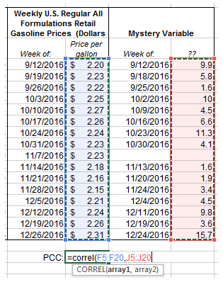
Note—Mystery Variable had no available data for the week of November 7, 2016
With a PCC of 0.592, I could feel great that I have another factor to add to my model. Looking at the data visualizations below does nothing to dispel that notion, either.

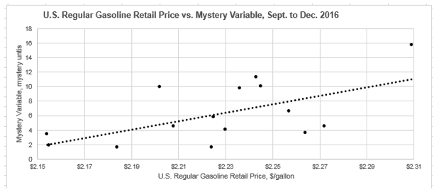
The issue is, however, not realizing that if you wade through large enough sets of data you are virtually guaranteed to find coincidental correlations. In this example, I was able to find just such a coincidental correlative data set by looking through the only other vast set of data I spend as much (or sometimes, shamefully, more) time with than energy-related data—fantasy football! Yes, the mystery variable that appeared to correlate decently well with U.S. gas prices from September to December of 2016 was actually the standard fantasy points scored by Washington player, Chris Thompson (missing data for the week of November 7 was due to his bye week).

Source: Wikicommons
The man that correlates with gas prices
After revealing the actual source of my mystery variable, you would obviously have me pump my brakes on any correlation. There is no possible explanation for why these two variables would be correlated (unless perhaps you would like to make the argument that when the price of gas goes up, Chris Thompson drives less and walks to and from practice—thus improving his cardiovascular endurance and improving his performance that subsequent week; I unfortunately could find no information on his in-season transportation habits).
The fallacy of connecting my mystery variable to gas prices would almost certainly have been exposed were you to test the correlation through expanding the data set and logical reasoning, as previously discussed. Unfortunately, other factors will not always be so obvious to rule out—which is why having as large of data sets as possible is key. Even then, however, you are bound to stumble upon these coincidental correlations (for some thoroughly entertaining and statistically vigorous examples, check out the Spurious Correlations blog) when casting a wide enough net. That fact is just one of the quirky statistical truths with very large sets of data (if interested on this topic specifically, I’d highly recommend reading either or both of these two fabulous books: The Drunkard’s Walk: How Randomness Rules Our Lives & The Improbability Principle: Why Coincidences, Miracles, and Rare Events Happen Every Day)
Beyond that, even if the correlation might seem sound, keep in one of the firs things taught in introductory statistics, and also one of the first things forgotten, that correlation is not causation (credit to Thomas Sowell). So while our fantasy football to gas prices comparison is a false correlation, even a true correlation does not automatically let you leap to the conclusion that one variable must be causing the other– a topic that this section of the blog will assuredly revisit in a future post. For now, though, I’ll leave it to America’s favorite statistician to summarize:
“Most of you will have heard the maxim “correlation does not imply causation.” Just because two variables have a statistical relationship with each other does not mean that one is responsible for the other. For instance, ice cream sales and forest fires are correlated because both occur more often in the summer heat. But there is no causation; you don’t light a patch of the Montana brush on fire when you buy a pint of Haagan-Dazs.”
― Nate Silver, The Signal and the Noise: Why So Many Predictions Fail–but Some Don’t